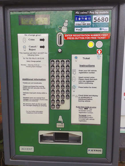
CAR PARK TICKET MACHINEOne of the worst designs of a user interface I’ve seen in a while.
The keypad goes from top to bottom, with numbers in the first column. This non-intuitive layout makes it very difficult to find the letter or number you want. The bright yellow button is NOT the one to press to get your ticket; pressing that one will cancel everything and you’ll have to start again. An extra arrow has been added, presumably because people kept pressing the wrong button. Under the ‘additional information’ there is an interesting piece of information: “Tickets purchased the evening before and will calculate into the next day”. |

